To figure out what research is relevant to climate risk tools, we selected a sample of tools (n=14) and categorized their overall content based on three
fields of literature: risk, climate change communication and data visualization. Next, we created a set of research-supported criteria for each field and listed them into an evaluation
matrix, termed for this study as the Climate Risk Tool Matrix. Risk is notoriously complex to define, so we followed the design of models used by the Intergovernmental Panel on
Climate Change, known as
integrated assessment models.
These models connect economic and climate data together to assess human influences on the Earth and how likely impacts are to
occur.
Economic Risk covers criteria based on historical-looking data while
Climate Risk covers criteria based on future-looking analyses.
Climate Change Communication evaluates
how tools shape climate messages for individuals, communities, and mass audiences.
Data Visualization covers all of the interactive features in climate risk tools and evaluates
how the visual nature of tools blend with practical graphs, dropdown menus and map interfaces.
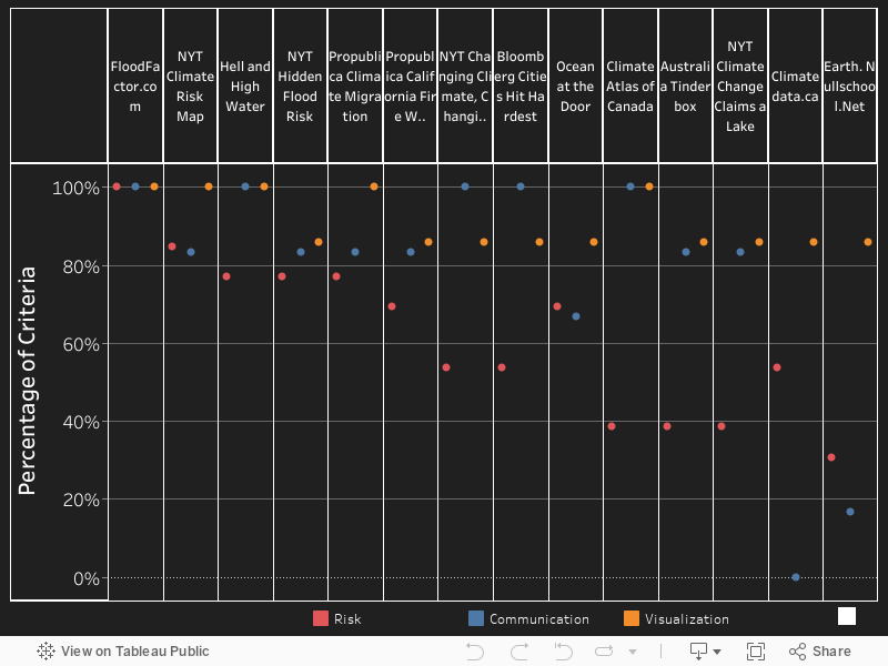
The sample is a selection of currently available public tools that range both in subject matter (flooding, wildfire, sea-level rise, etc.) and location (United States, Australia, Indonesia, and Canada). As a representative selection, most tools are from the United States, and only two Canadian tools were found and selected. The Climate Risk Tool Matrix was used as a checklist of whether a given criteria in either risk, communication or visualization was either ‘present’ or ‘absent’ in observing the tool. This methodology was used for each tool in the sample to observe features, tool focuses and trade-offs in each category of criteria. The results of the Climate Risk Tool Matrix are illustrated below and show the overall ranking of tools from highest to lowest.
Click on a tool name to view hyperlinks.
Out of 14 tools, only 1 was able to capture all criteria in the Climate Risk Tool Matrix. Surprisingly, most of the sample struggled to achieve a similar degree of well-roundedness, as most tools only achieved a middle to low ranking in the risk category. Many tools are seen communicating climate change in a highly visual form, but most fall short of showing actual risk information that is relevant to economic or climate-related circumstances. Another finding is that the two Canadian-focused tools fell short of reflecting a range of key criteria in all categories, suggesting that practices implemented in higher ranked tools have yet to be used in Canada.
To fill this gap, key practices and features that captured criteria across the sample were observed. We synthesized key practices for risk, communication and visualization from FloodFactor.com, Bloomberg Cities Hit Hardest, and Hell and High Water, respectively. These leading tools hold considerable knowledge to fill what’s missing in Canada and can help address this major gap in communication. Specifically:
- FloodFactor.com – This tool is the most focused in risk as well as the most well-rounded. FloodFactor is a tailored portfolio of potential flood risk information made available for any address in the United States. Much like a financial portfolio, several components break down climate risk through local flood maps, climate projections and creative visuals to capture the full scope of future flood risk, all the way down to the postal-code level.
- Bloomberg Cities Hit Hardest - This tool is the most focused in climate change communication. Bloomberg Cities Hit Hardest shifts the weight of climate change from global to local. Users are guided through stories, climate data and visuals with “scrollytelling”, a transition technique to populate data elements as the user scrolls through text. The intuitive use of scrolling lets readers understand climate data by showing stories on how flood risk for city populations are threatening cultural sites, public infrastructure, and increasing the risk of mass migration.
- Hell and High Water – This tool is the most focused in visualization. Hell and High Water is evocative by showing the severity of hurricane-caused storm surges for Houston, Texas. With 3-D animation, hurricane scenarios and investigative reporting by ProPublica, this high-powered tool is dense with alarming flood maps, illuminating narratives and community worries about withstanding the next big storm. Hell and High Water innovatively conveys the complexity of flood maps, climate data and human stories in a visually refined form.
There is much to learn for Canadian tools – we can see we’re only scratching the surface of what can be done to enhance communication of climate risks. That said, if only a few improvements provided by the Climate Risk Tool Matrix are deployed in new tools, Canadian communities will have a better chance to understand climate risk and take action. British Columbia residents could find and understand future flood risk in their area and choose what home or place of business is least likely to flood. Winnipeg and Toronto residents could understand how future smoke-filled skies can affect their long-term health and what steps they can take to prevent adverse effects. Halifax and St. John’s residents could understand how more frequent and severe Atlantic storms will affect their homes and community. It’s clear more can be done to communicate and create opportunities for individuals, communities, and governments to make decisions towards resiliency and adaptation. By pushing forward innovative communication tools, we can reveal the risks we already face and prepare for the future.
With the Climate Risk Tool Matrix below, select a leading tool and click on a Criterion in the table to see how key practices were observed in the study.